Have you ever died during a Power Point presentation? I am on my ninth life! We all have seen too many of those monotonous ramblings that have summoned the paramedics. Despite such dismal statistics, e-learners continue to toy with Power Point to create courses that damage more than build the learning process. Let me explain how the human mind works (and help you restructure your e-learning design toolbox).
The Candy Shop Dilemma
You are walking down a lane and you come across two shops. One displays a sign that says “Buy two candies and get one free!!” On an impulse, you want to grab the freebie. “One for me, one for Diana and one for Cameron”, you have it all figured and open the door to get into the store. However, your vision periphery on the left catches a red. “Is that an orange color?” You wonder, unsure, and turn to confirm. “Wait, that’s a Reese’s candy!” You recognize the familiar, the door of the store slowly slipping from your grasp. As you inch closer to the sign displayed on the next store, you can see all your favorite candies, mouth wateringly half peeled. There’s no deal, but you decide to check out what variety they have.
So who got your business? The shop with a lackluster, black and white sign or the one with the visually appetizing (and sinful) images of candy? Never underestimate the power of a visual. While a dull image fails to stimulate cognitive processing, the over-use (abuse) of images pushes the mind to the brink of cognitive overload (Stull & Mayer, 2007). Cavemen and the pharaohs knew what they were doing when they used pictographs and hieroglyphics to communicate.
Moral of the Story
Images and visual elements are your best marketing tools. Was it any surprise when Richard E. Mayer (2009, 2014) came up with The Cognitive Theory of Multimedia Learning? Let’s walk through the twelve multimedia instructional principles he put together to create meaningful learning experiences. Hold the thought, watch the 7 Tips to Beautiful Power Points to get the idea first:
Now, do not assume that I am promoting Power Point as the perfect course development tool. I am merely pointing how most of us have failed miserably in utilizing a simple tool to create powerful messages. Would you try an entree` if it was less than appealing? While there are definitely better tools, check lists and modern templates to create a course, a list with a strong scientific backing takes the trophy!
Mayer’s Best Practices Rules
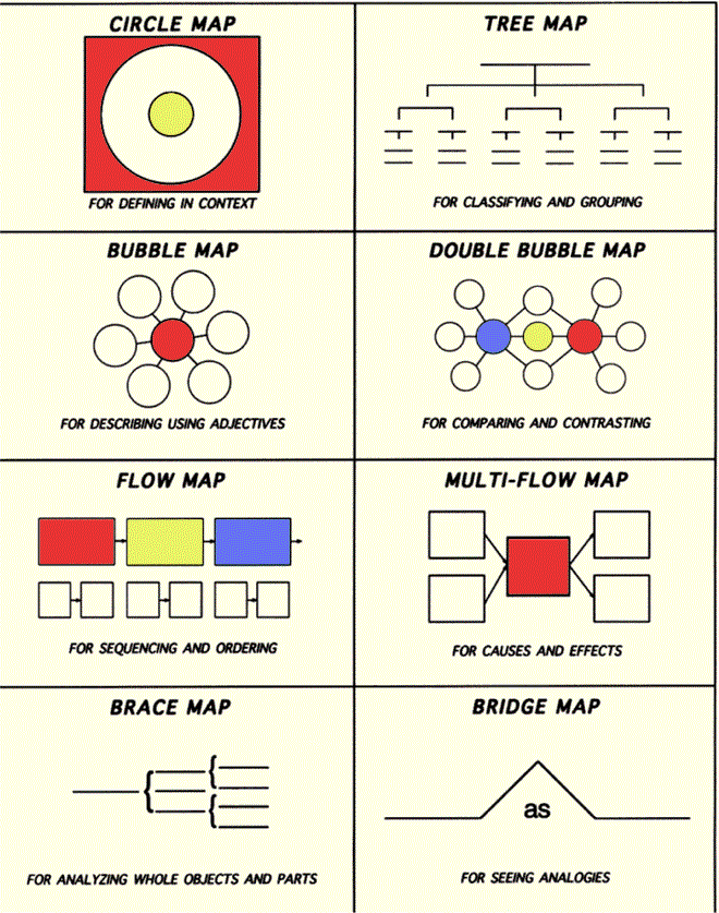
- Coherence Principle: Less is more when it comes to adding text. Consider using Thinking Maps as tools. Remember the character sketches we did in grammar school? There is nothing more comforting than the old and the familiar. Use Thinking Maps as tools to convert text into concrete maps. Even easier if you are utilizing Powerpoint use SmartArt instead of text on each slide. It is easy and powerful.
-
Signaling Principle: You know you are a mainstream 3D consumer when you reach for your 3D glasses to view another blockbuster. For the rest of us, a less pervasive 3D learning environment works its charm by shifting focus from thinking hard to absorbing completely. Consider developing courses with interactive scenarios.
-
Redundancy Principle:Captions in a picture add to the story that is forming in our minds. Images that relate to our personal lives pique and maintain our interest longer. Use a voice-over to explain an image, graph or a diagram to guide towards your learning objectives. Include a glossary of terms at the end of your course. Also add a section in the beginning that describes “how to use this course”. For a good example on colors and fonts by William Horton, view this course.
-
Spatial Contiguity Principle: Use descriptive text to explain the purpose of each image. Interactive dialogues in speech bubbles serve the same purpose. We are immediately drawn into the scene and want to apply skills to solve the conflict. View an example of a course with text, image and narration working in harmony. Also, look at this interactive example.
-
Temporal Contiguity Principle: Create slides with images and their text placed close to each other, rather than a slide of image followed by a slide of its text. Use at the most three distinct font type-faces with three colors. Prevent your learners from getting off-track! No one likes to ask for directions. We feel confident with our GPS. That goes twice for online courses. Provide clear directions and progress status in your courses. Navigation aids, using icons goes a long way. Just like the breadcrumbs lead Hansel and Gretel back home, use vivid icons like these to generate a subconscious roadmap for your learner.
-
Segmenting Principal: Multimedia consumers are now avid multimedia producers. Provide one multimedia example for your concept (audio, video, graphics etc.) and ask learners to search for similar examples and upload for sharing. Selecting the right kind and volume of multimedia is a challenge in itself. Think about the preferred candy shop in the example above. The visuals were emotive and comforting. Omar & Mudasir (2014) in their recent research Multimedia Based E-learning: Design and Integration of Multimedia Content in E-learning confirm the affective value of images and its positive effect on cognitive generation. Colors are the main elements of an image. Use colors to create the right mood. If you have a storyline for your course, colors can provide an added dimension of self-discovery.
-
Pre-training Principle: Don’t we all enjoy movies after watching its trailer? The same applies for an online course. Provide snippets and glimpses of learning videos and materials to enchant your learners.
-
Modality Principle: Consider a course design with a graphic and narration, rather than graphic and text. E-Learning Art has some amazing modern templates and images, do check out!
-
Multimedia Principle: I have said this before, and it’s worth saying again: we learn better with images described by text, rather than text alone. Use an image that evokes curiosity, surprise and a smile in your learner.
-
Personalization Principle: Conversational style text is well-received than technical or formal tone. Look at the scenario based images above. They have speech bubble and thought clouds that replicate human speech and thought patterns.
-
Voice Principle: Always prefer to use your own voice to record a lecture than a machine voice. If you have accent woes, check out howjsay to practice better pronunciation. It’s worth it.
-
Image Principle: if you don’t like to expose yourself on a video or as a still image, you don’t have to. Research indicates a zero difference in learning achievement when the instructor’s image was displayed and not displayed on course materials. However, a first ice-breaker video will eliminate any feelings of isolation.
What’s next
Hopefully you have by now content that is engaging and properly structured for elearning.
Talentlms can offer you some considerable help on utilizing it in a proper way.
Time to amaze your learners!